
Site Architecture and Visualisations
Introduction to visualisations
This feature within Screaming Frog SEO Spider allows us to visualise the website in a different light and provide a greater perspective that can be hard to digest from a tabular format.
They provide an insight into how to structure the site better from a user experience point of view and offer a visual representation of what the site looks like with its respective click depth.
Found on the top menu.

There are two types of visualisations – crawl visualisations and directory tree visualisations.
Each version has a different format – a tree graph version and a force-directed diagram.
- Crawl Tree Graph
- Directory Tree Graph
- Force-Directed Crawl Diagram
- Force-Directed Directory Tree Diagram
NB: visual representations of each of these will be shown below.
Choosing which applies to your site depends on personal preference and the size of the site. It is only useful for up to 10,000 pages.
When a visualisation has reached the 10k URL limit, it lets you know when a particular node has children that are being truncated (due to size limits), by colouring the nodes grey. You can then right-click and ‘explore’ to see the children. This way, every URL in a crawl can be visualised.
The purpose of visualisations is to provide additional context to your understanding of the website structure, but they do not always tell the whole story. This is especially true as these elements are discovered in more depth via the window panes, which are already available.
However, they allow you to analyse the structure and form of the website to see how deep a user would need to click to ascertain the desired information, as well as a general feel for the size and silos of the chosen website.
Another area they help with is communicating ideas when brainstorming within your marketing team to see and understand the scale of your entity, as you can identify patterns that are more easily discovered than by a set of spreadsheets.
Visualisation elements
The visualisations are interactive. You can zoom in and out and move them around with your mouse.
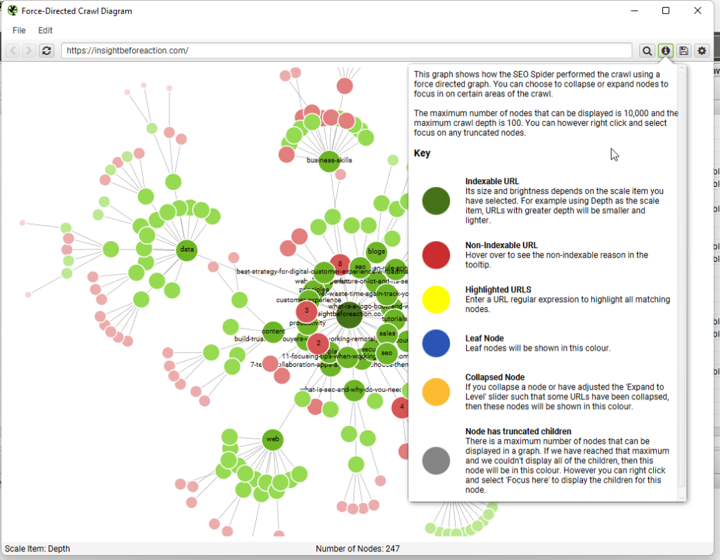
Rollover each element shows a popup which allows you to understand its relationship within the structure better. The example below is the ‘Force-Directed Crawl Diagram’.

On the top right of the popup is a cog icon which allows you to customise the visualisation even more. This changes lots of the aesthetics and allows you to brand the nodes and lines to match your corporate colours, which can be great if you wish to use them within a presentation.
You can also customise spacing, nodes, orientation, text, content inclusion, and colours to your personal preference. This can then be saved as an SVG or HTML file.

The darkest and largest green node is typically the homepage, and all other diminishing-size nodes denote their hierarchy within the crawl depth. They are also denoted from dark to light green.
Right-clicking on a node opens a popup with a choice to view within a browser to see what the page is or ‘Focus here’ to see that area of the visualisation only.
Green nodes are indexable pages, while the pastel red ones are non-indexable, such as 301 redirects, 404 or canonicals.
Crawl Tree Graph
It allows you to visualize the site’s structure and get a sense of its size or complexity.
The tree graph format visually is quite different to the force-directed crawl diagram, but fundamentally they represent websites in a similar way, with URLs represented by the circles and the shortest path by hyperlinks, as the lines connecting them.

Nodes represent the pages and the lines represent the links. Crawl depth is denoted by size and hierarchy.
Main use to highlight how the site is joined and no orphan pages. Spot any potential link issues by zooming in and out to gauge the feel of the site. For example, just looking at the structure of blogs.
Runs from left to right as default but by clicking the cog icon you can switch from top to bottom to see a stereotypical website framework.

The green nodes represent indexable pages, while the pastel red highlights URLs that are non-indexable. This makes it easy to spot problematic sections or pages of a website.
There are valid reasons for non-indexable pages, but visualising their proportion and where they are, can be useful in quickly identifying areas of interest to investigate further.

Force-Directed Crawl Diagram
Same as the crawl tree graph with the only difference being that it can be very useful to identify silos and their relevant content clustering. It is structured similarly to a heat map, with the darkest colour node at the centre and expanding out to the lightest colour node, which is several clicks away.
Great to identify weak nodes that can be improved by adding additional content or merging with better content.
For instance, tags show as weak and allow you to see where the strong and weak intent is within your site.
How the SEO spider has crawled the site with the shortest path to a page.
This is great for identifying site architecture and internal linking, which is ideal to find pages that are too deep to be clicked to and therefore, changing the linking connection.
It helps to spot patterns and issues on a website when you look at the green nodes rather than the red nodes.
Directory tree framework
Click just above the main window and below the tabs, the icon denoting a tree structure.
This correlates to the visualisation version which is the ‘Force-Directed Directory Tree Diagram’ and may be easier to analyse.
Force-Directed Directory Tree Diagram – clearer way to see the hierarchy structure of the site.
Shows the URL architecture of the website. Clumping of nodes are URLs that sit within their directory.
Please note: marked in red are no index and worth noting to ensure pages and posts are included within indexation.
Contains a description of the graph and its individual components under the ‘information’ icon.
When you click on a node you can zoom into that portion of the site to have a better idea of how it is structured.
The start of the tree is followed by the protocol (http or https), whether it is secure or not, then the host, which is the domain and then the path, which are all the URLs that sit immediately below the domain.
Now you’ll see all the separate directories, such as the blog or author directory.
It is great to identify websites that use templates, and an issue in one area of the website can be spotted easily elsewhere due to the path structure being too long or incorrectly set up. Easier to identify problems as compared to the crawl diagram method which can help with internal linking issues.