
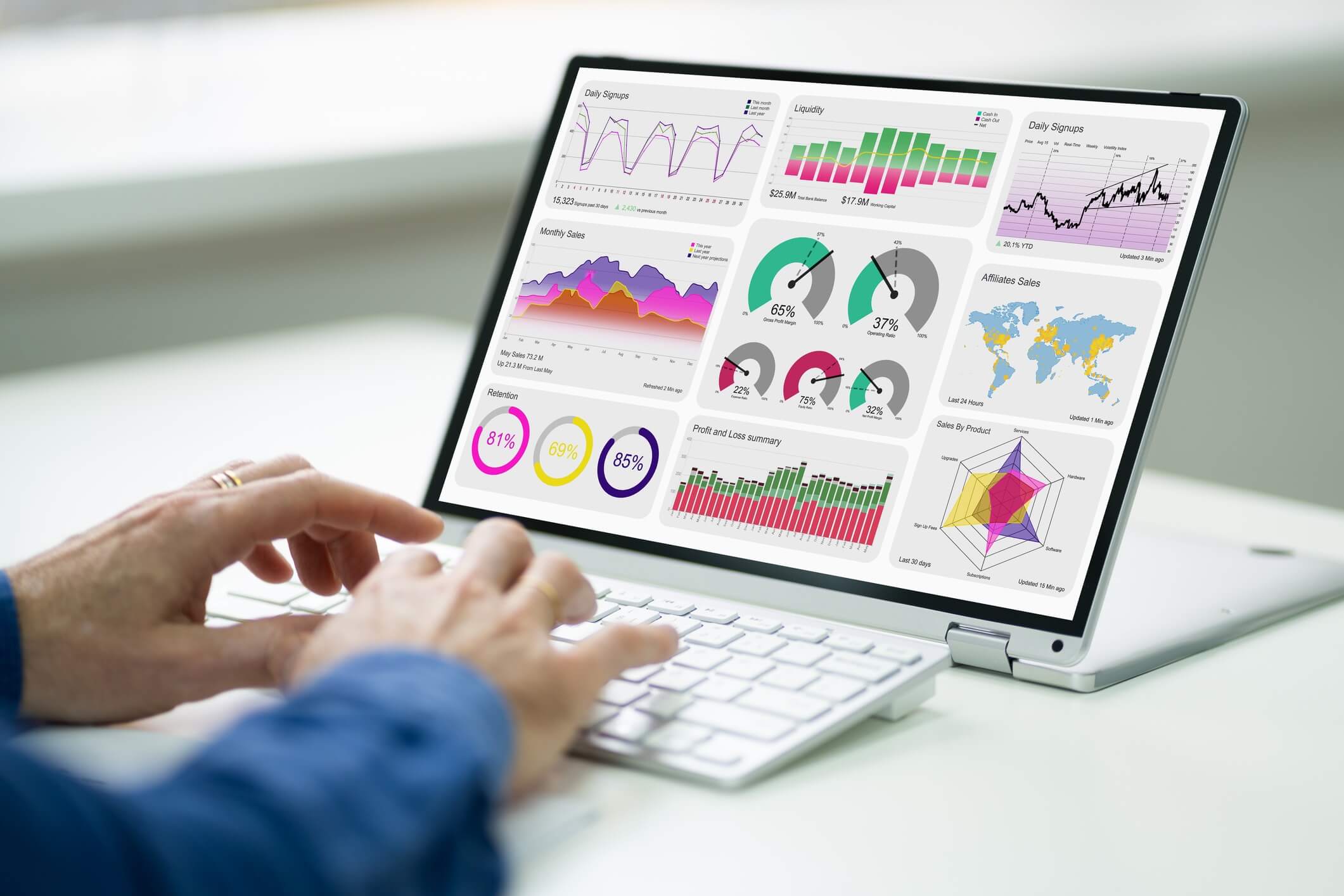
Creating a dashboard can seem daunting, but the process can be enjoyable and rewarding when you break it down into manageable steps. These visual tools help you track and analyse important data, making it easier to assess business performance and project management. By following a clear plan, you can showcase your data in an engaging way that supports marketing efforts and informed decision-making.
To start, you need to gather and prepare your data, which is crucial for accurate visualisation. After that, designing the layout and selecting the right Excel features can enhance your dashboard’s usability. Whether you’re aiming to monitor sales trends or team productivity, a well-structured dashboard can provide insights that drive your success.
By the end of this article, you’ll have a clear roadmap to create your own dashboard tailored to your needs. With the right tools and strategies, you’ll be equipped to turn raw data into powerful visual insights.
Key Takeaways
- Careful planning is essential for an effective dashboard.
- Data preparation significantly influences visual outcomes.
- Excel features can enhance your dashboard functionality.
Planning Your Dashboard
To create an effective dashboard, you must first establish clear objectives and understand your audience. Knowing the key metrics you want to track will guide the design process. Choosing the right visuals is crucial to convey your data effectively.
Defining Objectives and Key Performance Indicators
Begin by identifying your dashboard’s primary objectives. What do you aim to achieve? This can include tracking sales performance, monitoring website traffic, or assessing customer satisfaction levels.
Once your goals are clear, you need to define Key Performance Indicators (KPIs) that reflect these objectives. KPIs are measurable values that show how effectively you are achieving your goals.
For example, if your objective is sales growth, relevant KPIs might include monthly revenue, average order value, and customer acquisition cost. By narrowing down your focus, you can ensure your dashboard presents essential insights without unnecessary clutter.
Understanding Your Audience and Data
Your audience makes a significant difference in how you design your dashboard. Are you presenting data to executives, team members, or clients? Each group may require different information and visuals.
Engage with your stakeholders to gather their input on what metrics matter most to them. This involvement can help clarify expectations and ensure the dashboard meets user needs.
Also, consider the type of data you will include. You may work with raw data that needs to be simplified for presentation. Understanding how your audience uses data will help you prioritise essential metrics and create a more effective dashboard.
Selecting the Right Visuals and Charts
Choosing the right visuals is vital for making data easy to grasp. Different types of charts and visuals serve distinct purposes. For instance, line charts can show trends over time, while bar charts are suitable for comparing categories.
Incorporate tables, such as an Excel table, for displaying detailed data that users can interact with. This allows your audience to see raw data while easily spotting trends in other visuals.
Balance simplicity and clarity in your design. Avoid cluttered layouts that can confuse users. Aim for a combination of visuals that clearly represent your KPIs while allowing quick insights. Well-chosen visuals help convey your message succinctly and effectively.
Gathering and Preparing Data
Before creating a dashboard, it’s vital to gather and prepare your data effectively. This process involves collecting data from various sources, cleaning that data to ensure accuracy, and organising it for analysis. Understanding these steps will set a strong foundation for your dashboard.
Collecting Data from Various Sources
Begin by identifying your data sources. Common sources include spreadsheets, databases, and online services. You might collect data from an Excel workbook or pull it from a cloud service.
When gathering data, ensure you check for relevance. Focus on metrics that directly support your dashboard goals. You can use APIs to automate data collection, which helps streamline the process.
Once you have your data, make a list of all the sources. This will help you keep track and ensure you’re not missing any important information.
Cleaning Data and Removing Duplicates
Cleaning data is crucial for accurate analysis. Start by looking for errors, such as misspellings or incorrect formats. You can use functions in Excel to highlight inconsistencies.
Removing duplicates is another critical step. Use the “Remove Duplicates” feature in Excel to filter the data. This ensures that your analysis reflects only unique entries, which can greatly affect your dashboard’s credibility.
Consider using conditional formatting to easily identify duplicates or errors in your data. Aim for a dataset that is clean and reliable.
Organising Data for Analysis
Once your data is cleaned, it’s time to organise it. Create a structured format that allows easy access. You can use pivot tables in Excel to summarise and analyse your data effectively.
Consider categorising the data into relevant groups. This makes it easier to identify trends and insights. An organised dataset not only aids in analysis but also prepares your data for visual representation on the dashboard.
Label your columns clearly and use consistent formats. This will help anyone who uses the dashboard understand it quickly. Proper organisation makes for a more user-friendly experience.
Designing the Dashboard
Creating a dashboard involves several key steps that are vital for an effective user interface. You’ll need to focus on establishing a clear theme, creating an accurate mockup, and customising charts and tables for your data presentation.
Establishing a Theme and Layout
Begin with a consistent theme that suits your data and audience. This may include colour schemes, fonts, and styles that enhance readability and engagement.
Consider using colours that are visually appealing yet easy on the eyes. Use bold for headings and italics for emphasis on important figures or titles.
A well-structured layout is crucial. Arrange your dashboard components logically. Group related items together for better flow. Typically, place key metrics at the top or centre, as the user’s eye is naturally drawn to these areas. Use whitespace effectively to avoid clutter.
Creating a Mockup
A mockup is a valuable tool in the design process. It allows you to visualise your dashboard layout without diving directly into the code or data.
Use software like Excel or design tools to draft your mockup. Include placeholders for charts and tables to map out where each element will sit. Pay attention to the size of each component to ensure they fit well together.
Assess your mockup from a user’s perspective. Ensure all elements are easily accessible and intuitive. This step can save time and resources by allowing you to identify adjustments needed before final implementation.
Customising Charts and Tables
Charts and tables are essential for data representation. Choose the right chart type based on the data you want to display. For instance, use bar graphs for comparisons and line charts for trends over time.
Customise your charts for better clarity. Add labels, legends, and tooltips for extra context. Ensure your tables are well-organised, using clear headings and consistent formatting.
Highlight key figures using colour, such as a distinct background, for the most significant data points. This draws attention and aids user comprehension. Adjust the size and layout of your tables to allow for a better visual experience on your dashboard.
Building the Dashboard in Excel
Creating a dashboard in Excel involves several key techniques. You can effectively use PivotTables and Excel Tables, apply conditional formatting for visual clarity, and add slicers to enhance interactivity. These features will help you display data trends clearly and make informed decisions.
Utilising PivotTables and Excel Tables
To create a dashboard, start by setting up your data in Excel Tables. This makes it easier to manage and analyse your data. Select your data range and navigate to the “Insert” tab, then choose “Table”.
Next, use PivotTables to summarise large data sets. To create a PivotTable, go to “Insert”, then click on “PivotTable”. Drag and drop fields to arrange your data. This allows you to highlight trends and key metrics effectively.
Ensure that you keep your tables updated. Excel Tables automatically adjust as you add new data. This ensures your dashboard reflects the latest information without needing constant manual adjustments.
Applying Conditional Formatting
Conditional formatting brings your data to life. It allows you to apply different formatting styles based on cell values. This makes it easier to spot trends and important figures at a glance.
To use this feature, select the range of cells you want to format. Then go to “Home” and click on “Conditional Formatting”. You can choose from options like colour scales, data bars, or icon sets.
For example, use colour scales to showcase performance trends. High values can be highlighted in green, while low values can be shown in red. This visual context will aid decision-making and improve data interpretation.
Adding Slicers for Interactivity
Slicers are a powerful tool to enhance the interactivity of your dashboard. They allow users to filter data easily, making it more engaging.
To add a slicer, click on your PivotTable, then go to “PivotTable Analyze” and select “Insert Slicer”. Choose the fields you want to filter by, such as categories or dates.
Once added, stylishly format your slicers to match your dashboard’s theme. This will create a user-friendly experience. Users can click on the slicer buttons to view different data segments, enhancing the dashboard’s functionality and user engagement.
Incorporating Advanced Excel Features
To create an effective dashboard, it’s essential to use advanced features in Excel. These tools help enhance your visualisations and streamline data management. Here are some key methods to incorporate advanced features into your dashboard.
Dynamic Charts and Data Points
Dynamic charts are essential for an interactive dashboard. They update automatically as your data changes, making it easy to present real-time information.
To create a dynamic chart, you can use named ranges or tables.
- Named Ranges: Define ranges that automatically expand as you add data.
- Excel Tables: When you convert your data into a table, Excel adjusts the chart range based on the table size.
Using dynamic data points allows you to highlight specific trends and insights. You can use data validation to create dropdown lists. This means users can select what to view, making your charts more interactive.
Linking Data Sources and Formulas
Linking various data sources in Excel can significantly enhance your dashboard. By consolidating data from different locations, you can create a more comprehensive view.
You might connect to external databases, such as SQL Server or Access. This integration helps in pulling live data, ensuring your dashboard stays up-to-date.
Using formulas like VLOOKUP and INDEX-MATCH can simplify data extraction from different sources. These functions help you reference and retrieve data efficiently, allowing for smoother report generation.
Setting up PivotTables can also assist in summarising large data sets. They allow you to filter and analyse your data dynamically, presenting it in a clear and concise manner.
Leveraging Excel’s Power Features
Excel has many powerful features that can elevate your dashboard. Using Power Query, you can transform and prepare your data effortlessly. It allows you to cleanse, shape, and connect multiple data sources.
Additionally, leveraging Power Pivot enables you to handle large amounts of data efficiently. You can create complex data models and relationships, giving you deeper insights during analysis.
Another important feature is conditional formatting. This helps highlight key data points visually. By using colour scales or icons, you can draw attention to specific trends or issues in your data.
Using these advanced features can greatly enhance your dashboard’s functionality and make your data analysis more effective.
Finalizing and Sharing the Dashboard
Before sharing your dashboard with others, ensure it effectively communicates your key performance indicators. Clarity and readability are crucial so that users can easily interpret the data. You can also export your dashboard, making it convenient for presentations or reports. Gathering feedback will allow you to make necessary adjustments.
Ensuring Clarity and Readability
To make your dashboard clear, focus on visualising data effectively. Use interactive charts that highlight important trends and metrics. Place your key performance indicators prominently for quick access.
Keep text concise and labels clear. Use bullet points for lists to break down information and make it digestible.
Consider adding colour coding to help differentiate data sets. Ensure that your graphs are easily interpretable. Test your dashboard with colleagues to identify any areas that may cause confusion.
Exporting to PowerPoint or as a Report
Once your dashboard is finalised, you may want to share it as a report or presentation. Most dashboard tools allow you to export your work directly to tools like PowerPoint. This feature is useful for presenting findings to stakeholders.
When exporting, ensure that your visualisations remain intact. Check that charts and tables display clearly on different screen sizes. If necessary, customise the exported format to suit your audience better.
Make sure your report highlights key insights drawn from the data. This helps guide discussions and decisions during meetings. Always review your exported files for accuracy before sharing them.
Gathering Feedback and Making Adjustments
After sharing your dashboard, solicit feedback from users. Ask specific questions about their experience and how they interpret the data. Use their insights to identify areas for improvement.
Create a feedback loop where users feel comfortable sharing their thoughts. Regular adjustments based on user input will enhance usability over time.
Monitor how often the dashboard is used and whether it meets the intended goals. If users report problems interpreting the information, consider revisiting your design to clarify any issues.
Analysing and Interpreting Dashboard Data
In this section, you will learn how to identify trends and patterns, compare values, and present insights effectively. These skills are crucial for understanding data and communicating findings to stakeholders.
Identifying Trends and Patterns
To analyse dashboard data, start by looking for trends. Trends can show how data changes over time, such as sales increases. You can use line charts to visualise these changes clearly. For example, a line chart showing monthly sales can help you identify seasonal trends.
Patterns also matter. They reveal recurring behaviours or events. For instance, if customer complaints rise after a product launch, this pattern needs addressing. You can apply filters to your dashboard to focus on specific data ranges, making pattern identification easier.
Using colour coding can help highlight significant trends. For instance, green can indicate growth, while red can signal decline. This visual aid quickly captures your attention and guides your analysis.
Comparing Values and Analysing Performance
Comparing values allows you to assess performance across different timeframes or categories. For instance, you might compare last quarter’s sales with this quarter’s. Bar charts are effective for this purpose, as they clearly display differences.
You should also analyse key performance indicators (KPIs). KPIs help you measure success against goals. If your goal is to increase sales by 20%, tracking monthly sales against this target shows your progress.
Creating tables can help summarise comparisons. For instance, list different products alongside their sales figures to find which ones perform best. This format provides a quick snapshot of performance.
Presenting Insights to Stakeholders
Once you have analysed the data, it’s time to share your insights. Presenting findings clearly ensures stakeholders understand the implications. Start by highlighting key trends and patterns that matter most to them.
Utilise visuals like charts and tables to support your narrative. For example, a pie chart can effectively show market share among competitors. This makes it easier for stakeholders to grasp complex information quickly.
Be prepared to explain the significance of your findings. Use clear language and avoid jargon to ensure your audience fully understands. Tailoring your presentation to address stakeholders’ interests can help gain their support for future initiatives.
Frequently Asked Questions
Creating a dashboard involves several critical steps and tools. Each tool has its unique features, enabling you to craft dashboards that suit your specific needs. Here are some common queries related to dashboard creation.
What steps are involved in crafting a dashboard in Excel?
To create a dashboard in Excel, start by defining your data sources. Collect the necessary data and organise it in a clear format within spreadsheets.
Next, use Excel’s charting tools and PivotTables to visualise your data. Arrange these visuals on a single sheet to create a cohesive dashboard layout.
Finally, format your dashboard for clarity, ensuring that it is easy to read and interact with.
How can one set up an automatically updating dashboard in Excel?
To set up an automatically updating dashboard in Excel, you can use dynamic data sources such as tables or named ranges.
Link your dashboards to these data sources, and use Excel’s built-in features like Power Query to refresh data automatically.
You can then set your dashboard to update at regular intervals, keeping your information current without manual input.
What are the procedures for establishing a dashboard within Power BI?
In Power BI, start by importing your data from various sources, such as Excel or SQL databases.
Use Power BI’s tools to transform and model your data as needed.
After that, drag and drop visuals onto your report canvas to build your dashboard. You can publish your dashboard to the Power BI service for sharing and collaboration.
Could you explain the process for developing a web-based dashboard application?
To develop a web-based dashboard application, you first need to choose a web framework, such as React or Angular.
Next, set up a server to host your application and connect it to your data source using APIs.
Use visualisation libraries like D3.js or Chart.js to build interactive charts. Finally, ensure your application is user-friendly and responsive for different devices.
How might one go about creating a dashboard utilising Google Sheets?
Creating a dashboard in Google Sheets begins with organising your data in a clear spreadsheet format.
From there, use Google Sheets’ charting tools to create visuals directly linked to your data.
You can then arrange these charts on a single sheet to form your dashboard, ensuring it is interactive and easy to understand.
What are the fundamentals of designing a beginner-friendly Excel dashboard?
For a beginner-friendly Excel dashboard, keep the design simple and focus on clarity. Use clear labels for charts and ensure they accurately represent your data.
Limit the number of visuals to avoid clutter, and use contrasting colours for better readability.
It’s also helpful to provide tooltips or legends to guide new users in understanding their dashboards.

